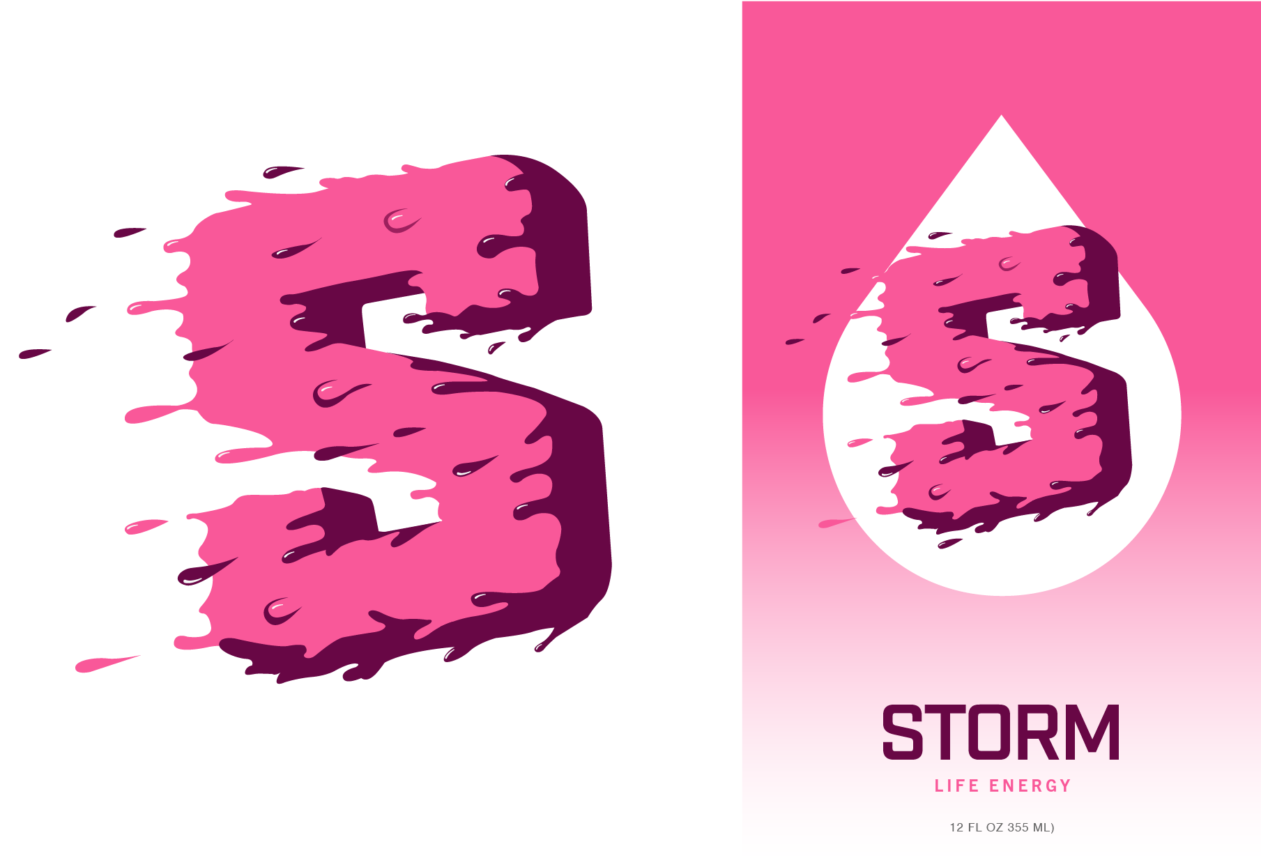
During a brand repositioning we were tasked with turning Reign Storm into Storm. This design exploration included new packaging, marks, type, colors and overall vibe. While these weren't the final selected design - these were a few I liked.
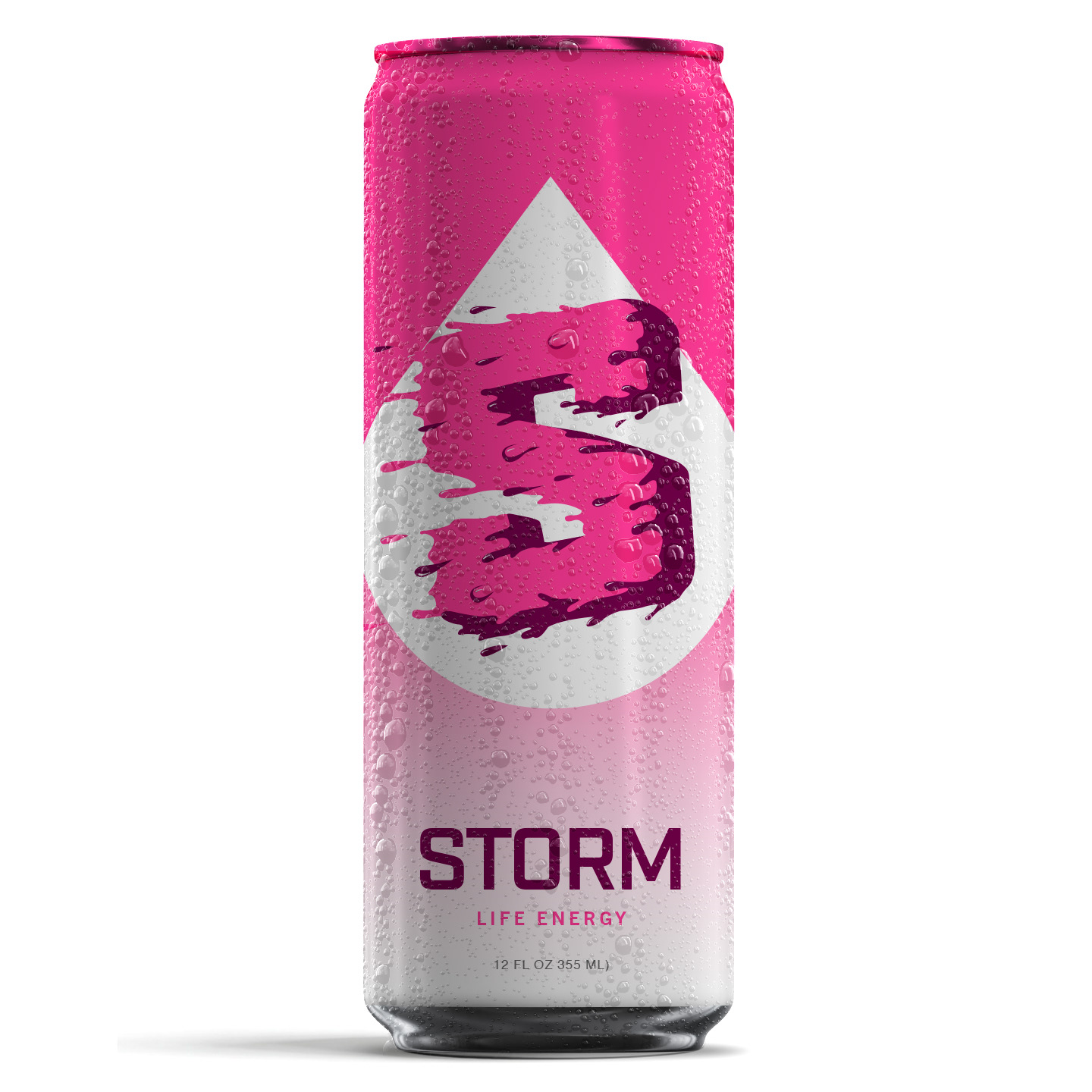
This first design was all about creating a strong mark that combined energy and liquid to make something unique, playful and own-able in the category.
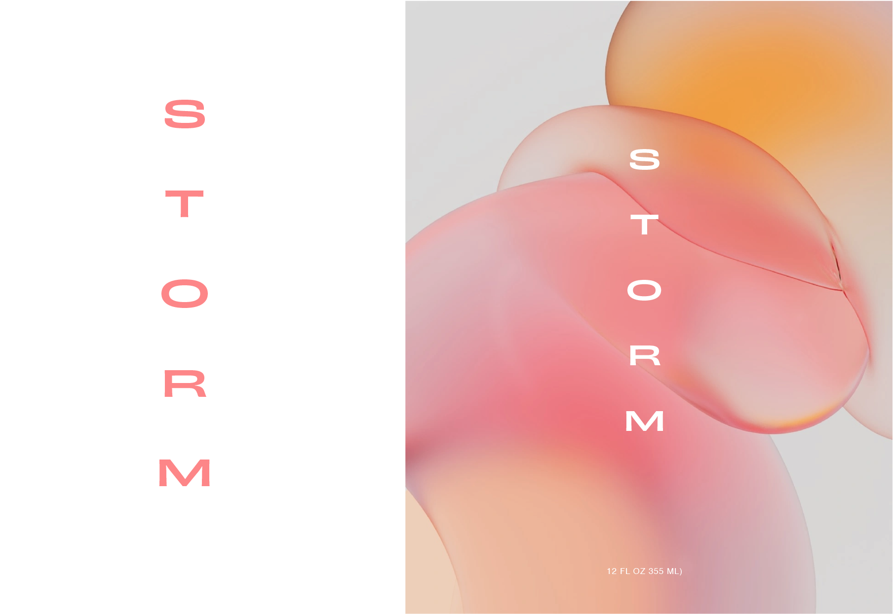
This design used abstract liquid forms to turn the can into a piece of modern art that could stand out on the shelves and feel different that other energy drinks.
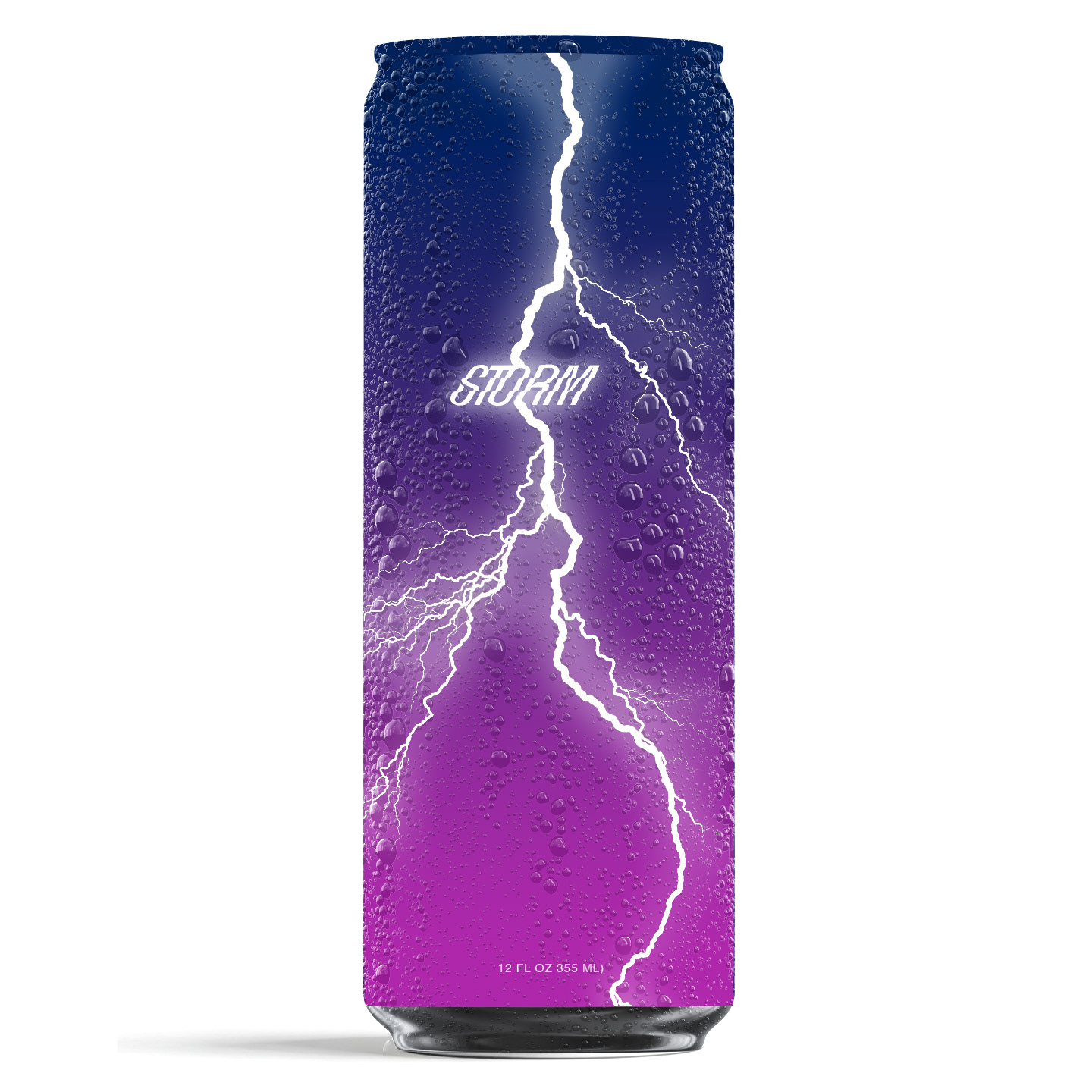
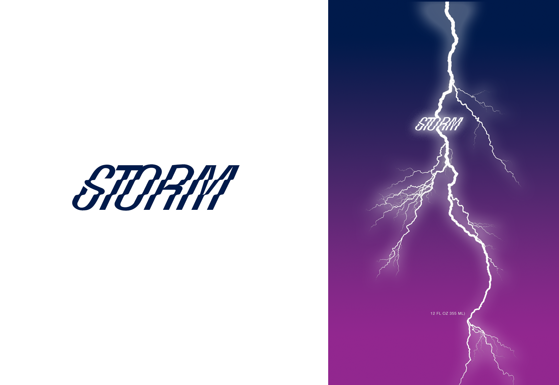
Energy of a storm manifests in lightning so for this design the idea was to represent that power in a way that felt modern, stylish and real.
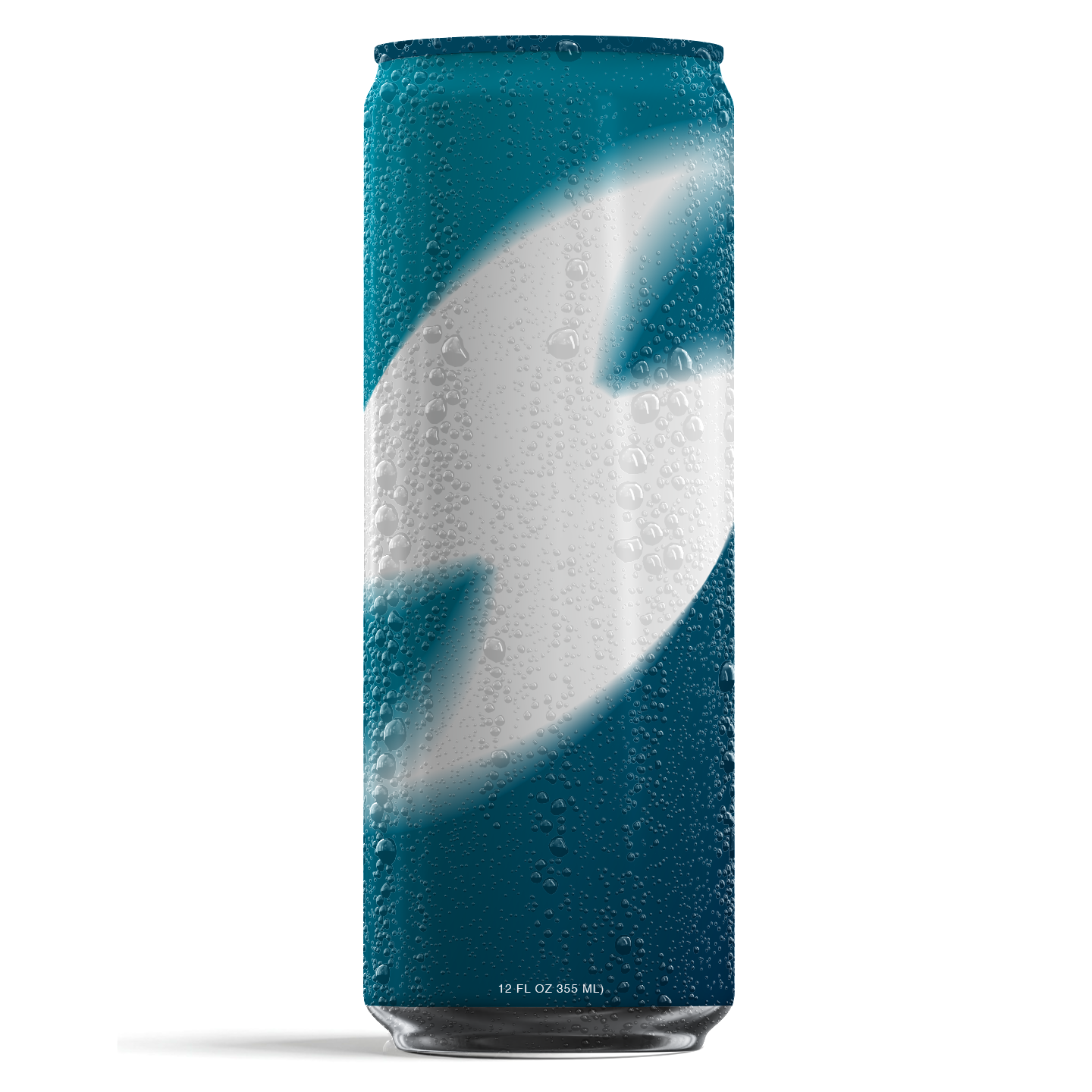
Brought in a motion blur effect on a traditional hurricane symbol to capture the sense of movement and energy in a storm that felt modern and elevated.
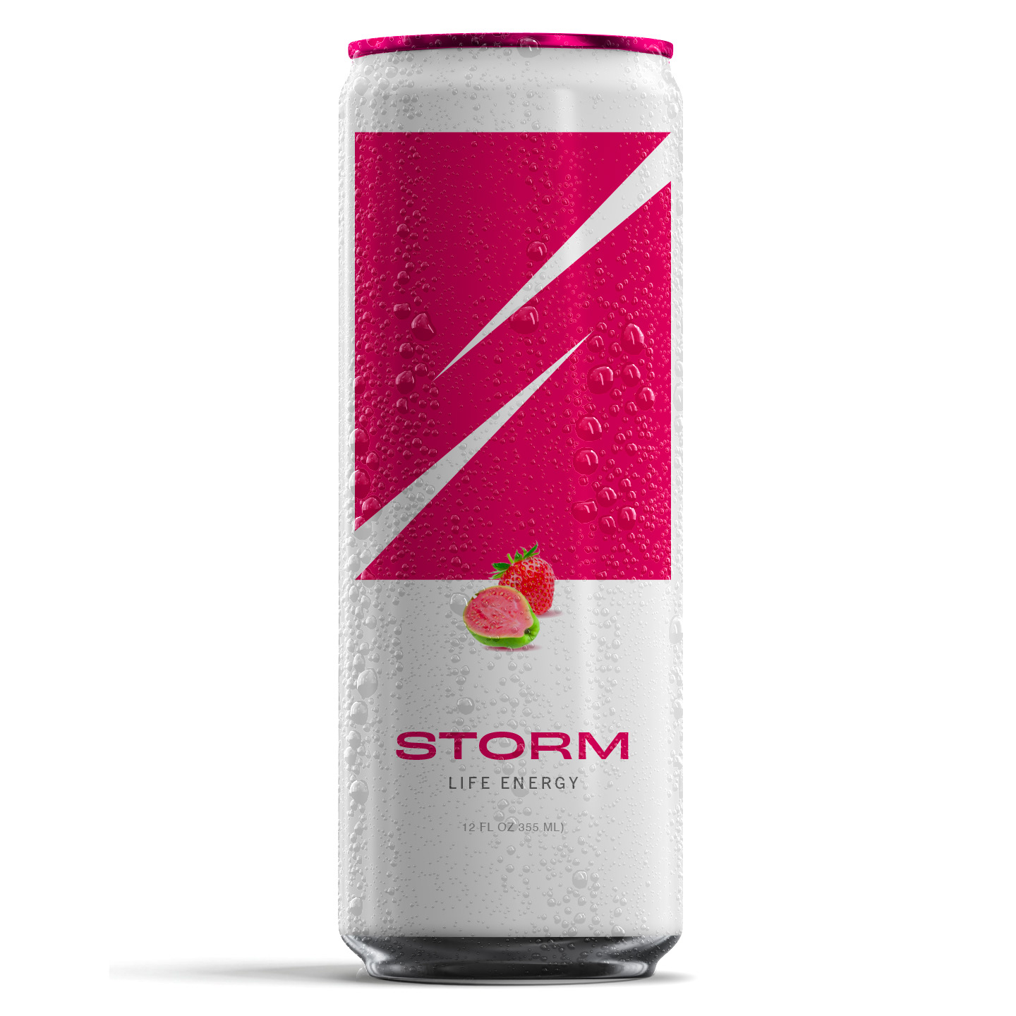
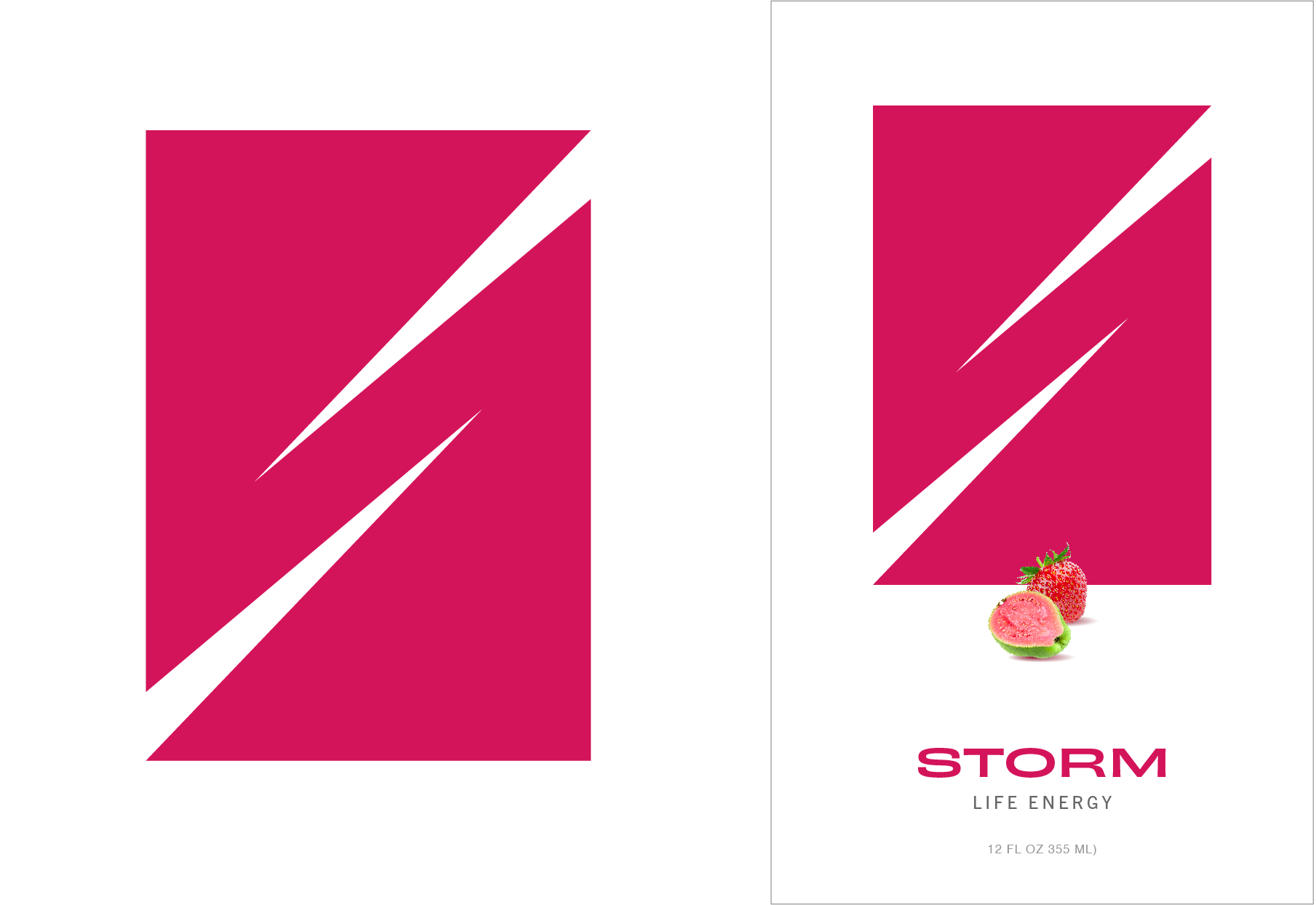
Another strong mark leading this design, but less directly lightning bolt and more inspired by the sharp edges and point to create an S that a brand could grow around.